
Why Your Website Gets Visitors but No Enquiries
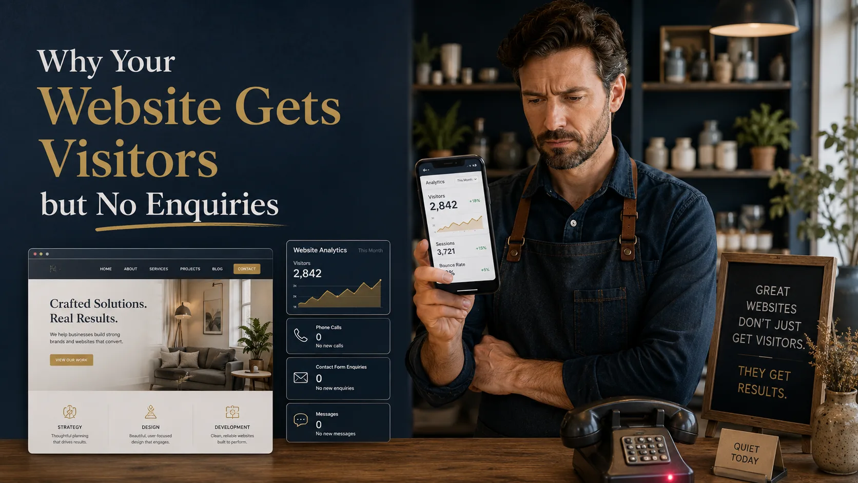
Getting traffic to your website is only half the job. If people are landing on your pages but not calling, emailing, filling in forms or requesting quotes, the problem is usually not visibility. It is what happens after the visitor arrives. This article explains why websites get visitors but no enquiries, and what to fix first if you want your website to generate business.
Traffic Alone Does Not Mean Your Website Is Working
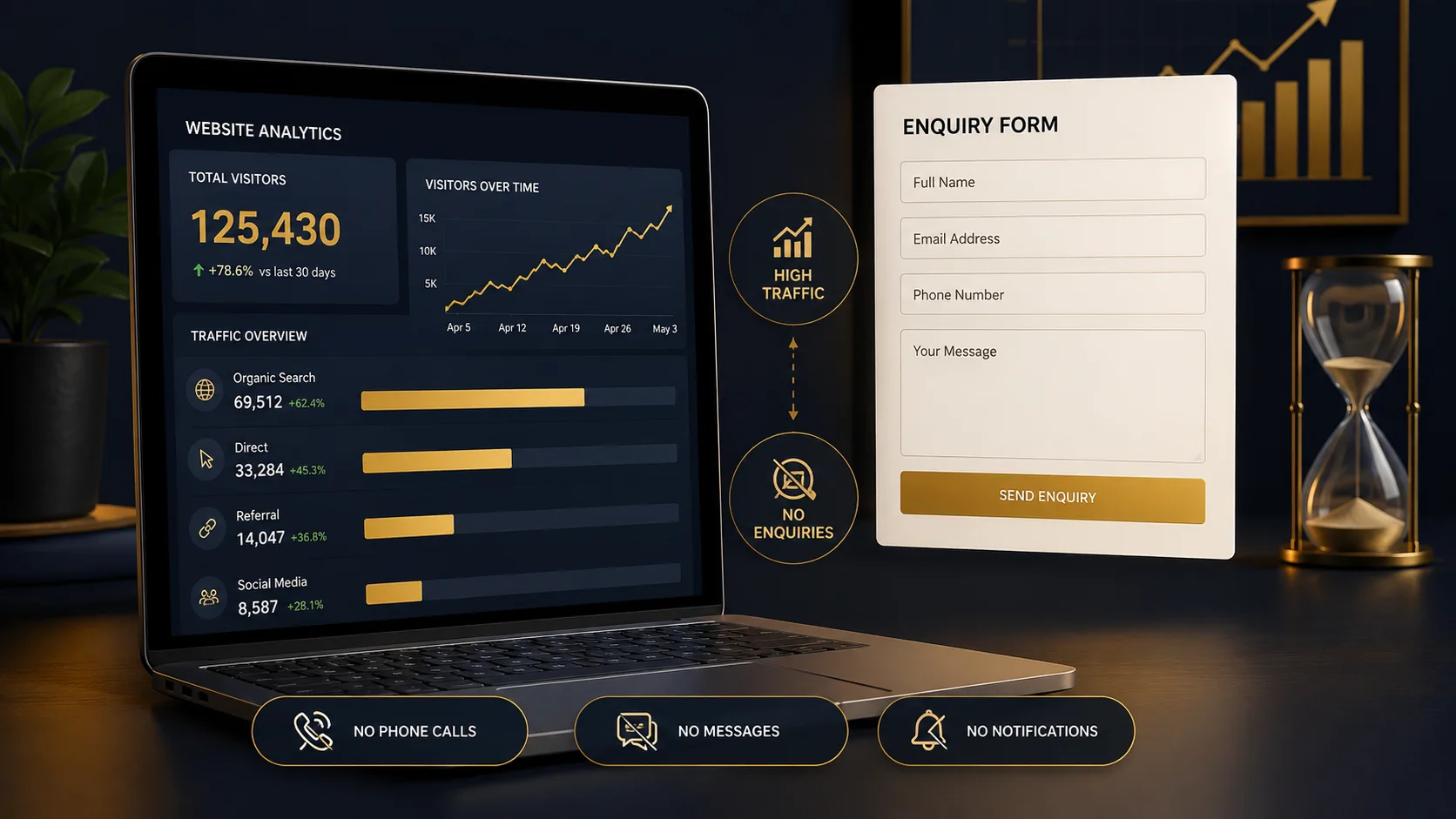
Many business owners look at their analytics and assume that more visitors will automatically mean more enquiries. Sometimes it does. More often, it reveals a different problem. People are finding the website, but something on the page is stopping them from taking the next step.
That is why a website should not be judged only by traffic. A more useful question is whether the right visitors are turning into useful actions. Those actions might be phone calls, contact form submissions, quote requests, bookings, product purchases or email sign-ups. If those things are not happening, the website needs to be looked at from a conversion point of view.
This is where good web design matters. Design is not just about how a site looks. It controls how quickly people understand your offer, how much they trust you, how easy it is to move around the site and whether they know what to do next.
Your Message Is Not Clear Enough
One of the most common reasons visitors leave without enquiring is simple: they do not understand what you do quickly enough.
This often happens when the homepage headline is too vague, the service pages talk too much about the company instead of the customer, or the wording sounds impressive but does not answer the visitor’s real question. Someone arriving from Google is usually trying to work out three things:
- Does this business offer what I need?
- Can I trust them to do it properly?
- What should I do next?
If the page does not answer those questions quickly, the visitor may go back to the search results and choose someone else. This is especially important for service businesses, where visitors are often comparing several providers before making contact.
A good test is to show your homepage or main service page to someone who does not already know your business. Give them five seconds, then ask what you do and who you help. If they hesitate, the page probably needs clearer wording.
The Call to Action Is Weak or Hidden
A visitor should not have to search for a way to contact you. If your main button is vague, buried too far down the page or surrounded by several competing options, people may do nothing.
Buttons such as “Learn More” or “Find Out More” can be useful in the right place, but they are not always strong enough for a service page. When someone is close to making an enquiry, they need a clear next step. Examples include:
- Request a Quote
- Book a Call
- Ask About This Service
- Get Website Advice
The wording should match the page. A visitor reading about SEO services may be more likely to respond to “Ask About SEO” than a generic contact button. A visitor looking at WordPress development may need a button that makes it clear they can ask about fixing, rebuilding or improving an existing site.
A strong call to action does not pressure people. It removes uncertainty. It tells the visitor what the next step is and makes that step feel easy.
The Contact Form Is Asking for Too Much
Forms are often where enquiries are lost. A contact form might look fine to the business owner, but feel like effort to a visitor. Long forms, unnecessary required fields, unclear error messages and broken mobile layouts can all reduce enquiries.
For most service businesses, the first enquiry form should be simple. You normally need a name, email address or phone number, a short message and perhaps one useful qualifier such as the service they are interested in. You can ask for more detail later once the conversation has started.
It is also worth testing your form properly. Fill it in on desktop and mobile. Check that the confirmation message appears. Make sure the email arrives. If you are using WordPress, form and email delivery problems are more common than many people realise. Regular website maintenance helps catch these issues before they quietly cost you enquiries.
Your Website Does Not Build Enough Trust
Most visitors are cautious. They may like what you offer, but still need proof that you are credible. If there are no reviews, no examples of work, no case studies, no clear business details and no signs that real people are behind the website, they may not feel ready to get in touch.
Trust signals do not need to be overdone. In fact, they work best when they feel natural. Useful examples include:
- Clear examples of previous work
- Genuine testimonials or reviews
- A proper About page
- Visible contact details
- Location information where relevant
- Professional images and consistent branding
Your portfolio is especially important if someone is close to buying. People want to see whether you have done similar work before and whether the quality matches the price. Even a small number of strong examples can help turn a cautious visitor into a serious enquiry.
The Site Is Slow or Frustrating on Mobile
A website can have good content and still lose enquiries if it is slow, awkward or difficult to use on a phone. Many visitors will not wait around while large images, heavy scripts or unnecessary plugins load. They also will not fight with tiny buttons, cramped forms or menus that are hard to use.
Mobile usability is particularly important because many service searches happen when people are busy. They may be comparing options during a lunch break, on a train or while dealing with a problem that needs a quick solution. If your site makes that harder, they may choose a competitor simply because their website is easier to use.
Speed and mobile layout should be considered during the build, not treated as an afterthought. This is one reason a properly planned WordPress website can perform better than a heavily patched together template site.
Your Pages Do Not Match Search Intent
Sometimes the website attracts traffic from the wrong type of search. This can happen when pages are written around broad keywords but do not properly answer the visitor’s reason for searching.
For example, someone searching for website prices is likely comparing options and trying to understand budget. Sending them to a generic service page may not be enough. A guide such as how much a website costs in the UK is more likely to match their immediate question, then guide them toward the right service.
Likewise, someone searching for a local provider may need reassurance that the business understands their area. That is why separate local pages, such as web design in St Albans or SEO services in St Albans, can be useful when they are written properly and not duplicated across every location.
The Website Looks Fine, but the Journey Is Broken
Some websites look professional at first glance, but still fail to convert. The issue is not always visual quality. It is often the journey through the page.
A good service page should usually follow a clear structure:
- Explain the service in plain language
- Show who it is for
- Explain the problem it solves
- Show why the business is credible
- Answer common objections
- Make the next step obvious
If the page jumps between ideas, hides important information or sends people away before they understand the offer, enquiries will suffer. This is why small layout changes can sometimes make a big difference. Moving a call to action, rewriting a heading, improving a section order or adding proof in the right place can be more valuable than jumping straight into a full website redesign.
How to Work Out What Is Going Wrong
You do not need to guess. Start by looking at the page as a new visitor would. Then check whether people are taking the actions you want them to take.
A practical review should include:
- Checking which pages receive traffic
- Testing the contact form and phone links
- Reviewing the homepage and service page headlines
- Checking speed and mobile layout
- Looking for missing trust signals
- Comparing your page against competitors
- Checking whether the page has a clear next step
If you run paid traffic through Google Ads, this becomes even more important. Every click costs money, so a weak landing page can waste budget quickly. Paid advertising should not be used to cover up a poor website journey. The page needs to do its job once the visitor arrives.
What to Fix First
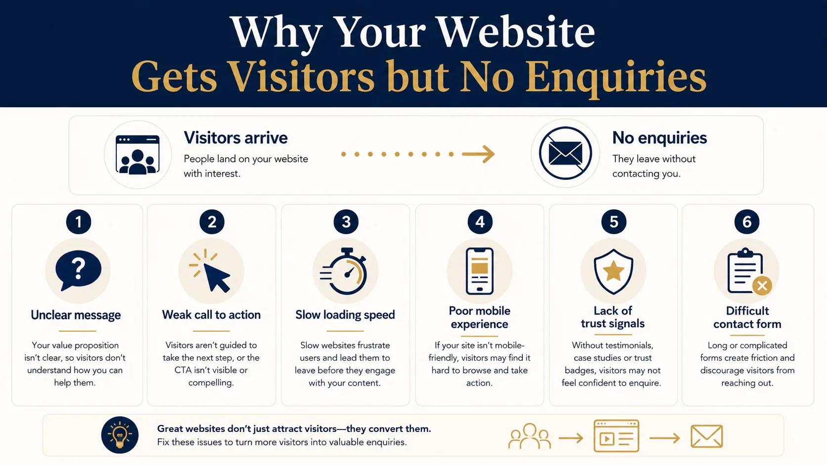
If your website gets visitors but no enquiries, do not start by changing everything. Work through the most likely problems in order.
1. Clarify the main message
Make sure the headline and first paragraph explain exactly what you do, who you help and why someone should keep reading.
2. Improve the main call to action
Use a clear button that matches the visitor’s intent. Put it near the top of the page and repeat it naturally where the page needs it.
3. Test the form and phone links
Make sure the basics work. A broken form can go unnoticed for weeks if nobody is checking.
4. Add proof
Show examples, reviews, case studies, accreditations or anything else that gives visitors confidence.
5. Improve speed and mobile usability
If the site is slow or awkward on mobile, fix that before spending more money on traffic.
Final Thoughts
Traffic is useful, but it is not the final goal. A business website should help the right people understand what you offer, trust you enough to make contact and take the next step without unnecessary friction.
If your website is getting visitors but not enquiries, the answer is usually not to chase more traffic straight away. First, make sure the pages receiving traffic are clear, trustworthy, fast, easy to use and built around a proper enquiry journey.
Need Help Turning Website Visitors Into Enquiries?
If your website gets traffic but does not bring in enough leads, Webtex can review the page structure, messaging, calls to action, speed and SEO foundations.


